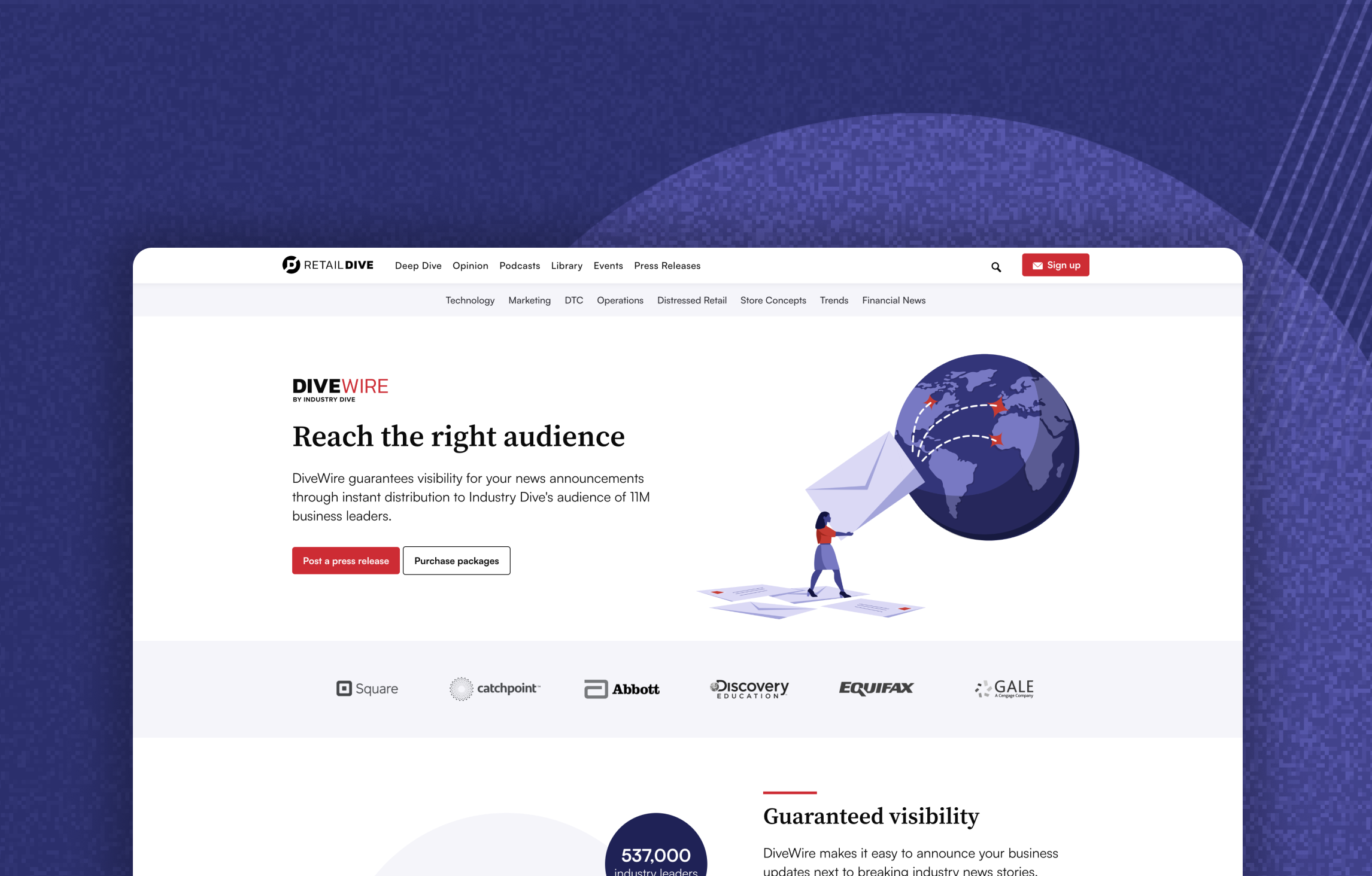
Diversify revenue stream & improve press release purchase flow
Goals:
Decrease cart abandonment rate
Increase revenue by improving average basket size
Decrease customer support request intake by improving checkout flow UX copy
Team:
Product designer (Myself)
Product manager
Development team
Product marketing team (stakeholder)
Overview
The Industry Dive Product team revisited the DiveWire Press Release purchase flow for all 33 unique industries to improve user experience and increase conversion, improving the checkout flow directly contributes to our revenue.
DiveWire launched in Q4 2021, this product caters to a variety of users from agencies, internal PR consultants, and marketing professionals. With the DiveWire platform, users can create and publish a press release on our publications and newsletters.
Addressing user frustrations
To identify existing user frustrations, I used HotJar web session recordings to understand how the users are interacting with our press release platform. My observations are as follows:
A high amount of screen/tab switching during the creation step, this behavior may lead to a higher chance of cart abandonment
Currently, the multi-media add on is a separate step before checkout completion, users need to return two pages if they were to edit changes
My observations above led me to consolidate the essentials for a user to create a full press release. Knowing this is a process that may need reviews and multiple edits, my design goal prioritized reducing friction points.
Project impact
Updated workflow reduced friction points and increased purchase completion rate by 8%
33% increase in paid multi-media add-on
Improved an additional revenue stream that is scalable
Conclusion
After several weeks of implementations and creating mockups for all the iterations, our work paid off when we started seeing a sales impact.
The design review process for this project was a treacherous journey. My Figma file tripled in size by our official launch date, the work required additional design system components, mobile screen-specific scenarios, as well as how-to documentation. It was all well worth the effort as we’re setting ourselves up for great success in the future.
It was heartwarming to see the team bond and share what we learned at he end of our journey. Besides creating a true safe space for open minded critiques, the team became stronger together and more knowledgeable than ever.


