Note to self: This is my sandbox moment and I treat this as a mental exercise to think of something new I would’ve done every time I revisit. Keeping this old case study here as a reminder of growth.
Increase efficiency for TinyTales users with Design Sprint
TinyTales is a new startup with a diverse online library of children’s educational materials, as TinyTales expand its selection of digital content, users are frustrated with the time-consuming process to find reading material.
As a UX designer, I planned a full week agenda, addressed user frustration, and solved the design challenge using the Sprint Method
I received the client brief from Bitesize UX including business goals, user research, and constraints

Day 1: Map User Experience

What’s the problem?
TinyTales users find the book search process difficult, and time-consuming
“Searching for the right book shouldn’t take this long!”
How would this help?
Solve user’s frustration and fulfill their needs
Increase user engagement
Improve children’s literacy

Observe Industry Leaders
Users need a simple and responsive filtering interface, to sort and connect with a wide range of content
I explored e-commerce leaders in books and kids media and focused on how they sort and organize content: PBS Kids, Amazon Books Search, Netflix Kids Mode, and Barnes and Noble
Observations and insights
“Sort by Age” comes first
Explore how gamification can drive user engagement, especially with younger users in reading achievements
Job To Be Done
As a parent with two kids, I want to quickly find suitable reading material, so I can enjoy quality time with my children.

Establish User Persona
User needs effective search and keyword filter takes precedence over other miscellaneous features
Quality Time: Jane values story time with her children and tries to read with them up to 3 times a week
Meaningful Topics: Jane recognizes the importance of early age reading, so she encourages her children to find topics they’re interested in
Problem Statement
How might we help parents spend less time finding great stories on TinyTales, that fit their children’s interest, maturity, and reading level?
Day 2: Sketch Solutions and Recruit Users

As I started sketching critical screens, I explored a variety of “quick-access” functions on the home screen using the Crazy 8 sketches technique, 8 sketches in 8 minutes. The sketching exercise was simple and easy to complete on my own, I spent the remainder of my time today prepping for user testing.

Sketch Solutions
Sketching 8 solutions in 8 minutes to think quickly and stay focused on critical features
I selected Homepage as my critical screen and envision how my user would proceed with the search function in different scenarios:
“No time today, what’s the quickest way to find what I’m looking for?”
“I may have a specific topic in mind, what’s the most effective way to narrow down my search?”
Day 3: Create Storyboard

Sketching critical screens highlights specific interfaces that solve user’s frustration on a micro-level, today I envision the user’s end-to-end journey with TinyTales, and how the interaction impacts their life.

Day 4: Low-Fidelity Wireframes

On day four, I allocated myself the bulk of my time for creating low-fidelity wireframes on Sketch, then I used the remainder of my time to designing a clickable prototype through InVision. I started with designing the critical screen with the Filter feature, then worked backward to fill in the rest of my user Red Route.
Low-Fidelity Screen Feature Highlights

Homepage Screen
Showcases featured contents from TinyTales to quickly capture user’s attention
Highlights pre-sorted categories for those users who are short on time and needs easy access to known favorites
“Sort by Age” needs to be most accessible for all users

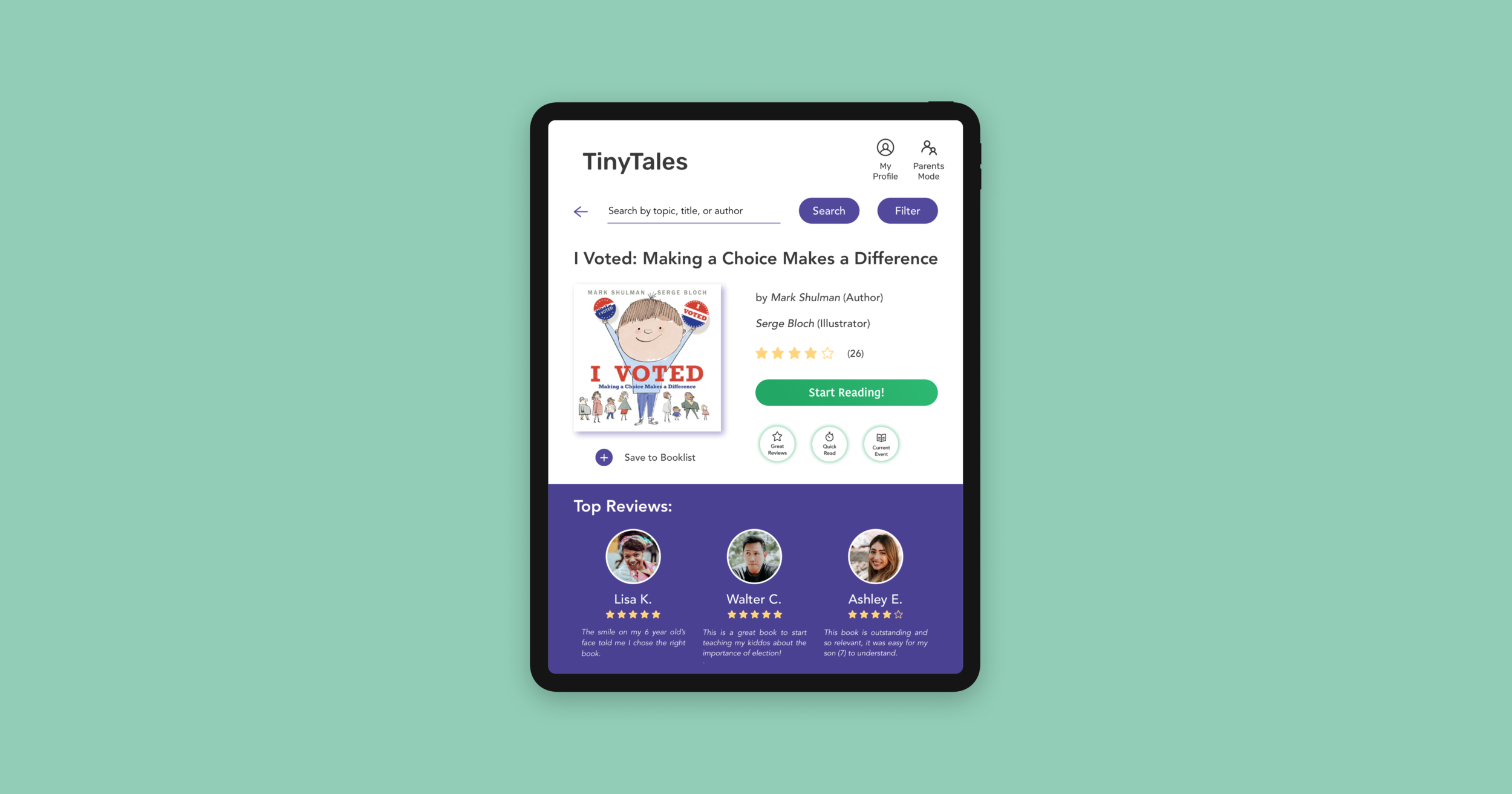
Search and Filter Screen
Button designs are great for quick selections, but will users seek a more precise method when using advanced search?
Sorting by category may be more useful for teens, is this helpful for my user with children, aged 4 and 6?
How can I highlight book-length in the Product Detail screen, this information could be helpful for my “short-on-time user”?

Book Detail Screen
Easy access to the Search and Filter function remains our user’s top priority
“Save to Booklist” lets user create their personalized book collection
User values reviews and recommendation from other parents
Day 5: Test Prototype

Users find the search bar and filter generally easy to use, but lack category diversity. Overall, the testing validates my initial design goal, which was to sort content quickly and shorten the user’s decision-making process.
Key Differences in Design Iterations

User Testing Insights

Search and Filter features are good starts, but users are looking for more autonomy
Optimize filtering by giving users access to remove and add more easily, it will allow users to update results without having to refresh the page or start over
How would the interface adapt to simultaneously show results as users apply filters?

Users prioritize sorting by age before accessing Filters
Users show preferences for Sorting by Age in several incidences, express it’s a good starting point if they don’t have a specific topic in mind
Update and sort book listing results below simultaneously as users select/deselect age group
Reflection and Takeaways
Sprint wouldn’t have been as successful if it weren’t for the planning
While working through the discovery phase of the design sprint, it was very tempting to start jotting down ideas and sketching wireframes, however, this approach would have led me to design the wrong product for the wrong audience.
The benefits of sprinting alone
This Design Sprint was an excellent exercise for me to practice the Agile Method, sprinting alone helped me better manage my time, as well as trust my problem-solving skills than relying on colleagues or project facilitators.
Further product exploration with Kids Mode
Two of my users asked how the platform would be different when in Kids Mode. I would first adjust user profiles as kids, then conduct further research in children’s content and media. I hypothesize there would be a significant change in language and color palette.