Voicevoice Internship: Winter 2020
Improve video platform usability with desktop redesign
Voicevoice is a web conferencing platform that differentiates itself by providing tailored breakout rooms for everyone, it challenges the way we perceive virtual meet-ups as passive listeners and highlights purposeful conversations as active participants. For this project, I worked with Voicevoice to identify user pain points and propose video platform redesign, with Anna and Michael as my design partners.
As a UX design intern, I studied survey feedback, identified user frustration, conducted competitor research, then presented design solution to stakeholders
For 6 weeks, I partnered with two other design interns, Anna Slautskaya and Michael Steeves, to ideate Voicevoice platform usability
Project methodology and process in sequential order from project scope, redesign, and user testing (L to R)
Problem: users reluctant to participate in conversations
After studying Voicevoice - provided survey feedback, I hypothesized, first-time users often feel uncomfortable speaking up during events because of a lackluster first impression of Voicevoice. The company homepage’s weak brand personality attributed to user’s feeling “uninformed” and “confused” prior to joining the event. It was important for our problem statement to incorporate our first-time user’s journey starting with the Homepage impression.
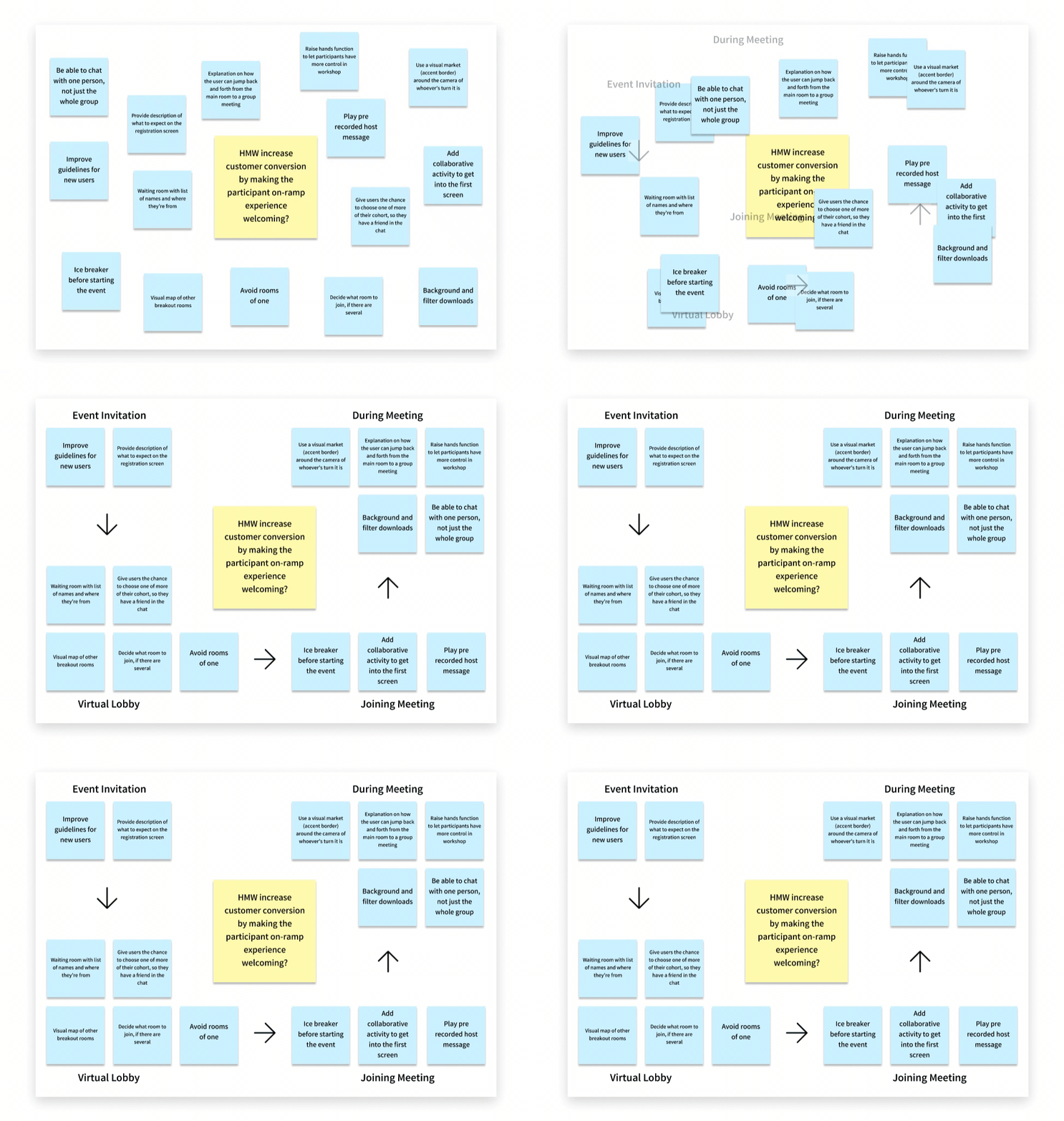
How Might We increase conversion by making the participant’s on-ramp experience welcoming?
I led my design team through a remote brainstorming workshop to solve the problem statement. We prioritized our solutions to address the most common user frustrations based on survey feedbacks:
Redesign homepage to improve Voicevoice’s initial brand impression
Offer a more informative onboarding experience
Create a welcoming platform experience
Target persona values connection and clarity
As a team, we studied feedback and organized findings into three categories by Affinity Mapping: goals, needs, and frustrations
We emphasized our target persona as someone with a managerial title and purchasing power within the department, our team envisioned a successful redesign would greatly increase the chance of converting from a first-time trial user to a potential subscribed client
Job To Be Done Statement
As a first-time event attendee, I want to feel comfortable participating on the Voicevoice platform, so I can network and participate in future events.
Redesigned the video platform to satisfy stakeholder requirements
At the current stage of our project, we set out to complete Sitemap suggestion and video platform redesign as our main deliverables. We first conducted Heuristic Evaluation on the current homepage, then Competitor Analysis on both direct and indirect competitors. Our analysis results, paired with a defined guideline for a successful redesign, helped shape our video platform wireframe proposals.
Sitemap redesign addresses the top three Heuristic Evaluation findings:
Help and Documentation
The pricing FAQ expands all answers across the page and pushes information that is not relevant to the user’s immediate goals
Maintain Consistency
The term “conversation” on navigation is unique to Voicevoice, but it can present a multitude of meanings. It requires additional context, therefore it can be unclear to users when it is used as a navigation tab
Visibility to System Status
The homepage invites users to RSVP to a list of events intended to gain interest by participating in events on the Voicevoice platform. Yet, it fails to inform users the events listed have passed, it is misleading to users who are interested in attending
Outdated homepage and platform flawed when compared to direct and indirect competitors
Direct competitors with niche market breakout-focused video conferencing products:
Wonder
Toasty
Indirect competitors setting leading video conferencing industry standards:
Zoom
Google Hangout
Stakeholder Requirements for a Successful Redesign
Video and Audio Setting Access
Easy access to video and audio settings is at the roots of any great video conversation platform; the user’s expectation for virtual communication is to have self-explanatory video and audio settings.
Host-less Experience Preparedness
Purposeful conversation with no host/moderator present is what sets Voicevoice apart. Our redesign must convey that Voicevoice is a safe space for first-time users.
Streamline Group Navigation
Improve Group Navigation features that facilitate discussion pace and direction intended by the host. Group navigation features are specifically designed by the event host to help facilitate conversation for all attendees, they help shape the discussion pace and direction.
Video Platform Redesigns
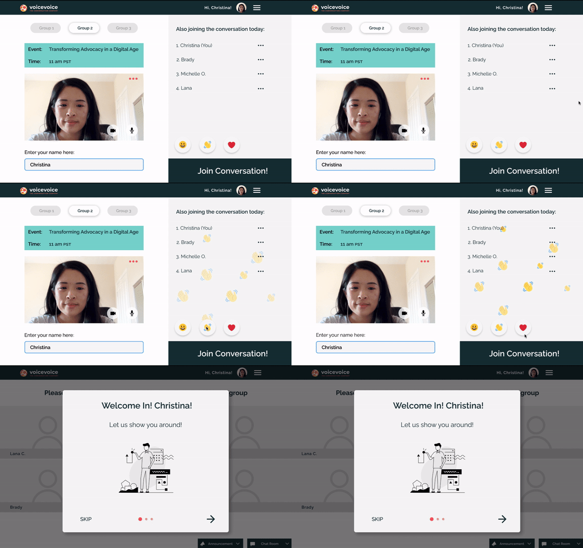
Virtual lobby prepares attendees for a host-less experience
Increase guest engagement and event visibility to create a more welcoming atmosphere and help warm up the conversation
Test webcam and microphone and adjust settings in the virtual lobby prior to the event starting time
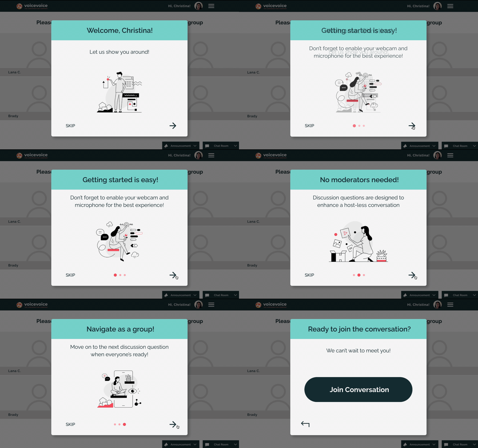
Low-effort onboarding slides walk through video platform basics in 3 simple steps
A minimal, low-commitment tutorial that instantly makes attendees feel more comfortable
Guides participants through the platform without being intrusive to their conversation experience
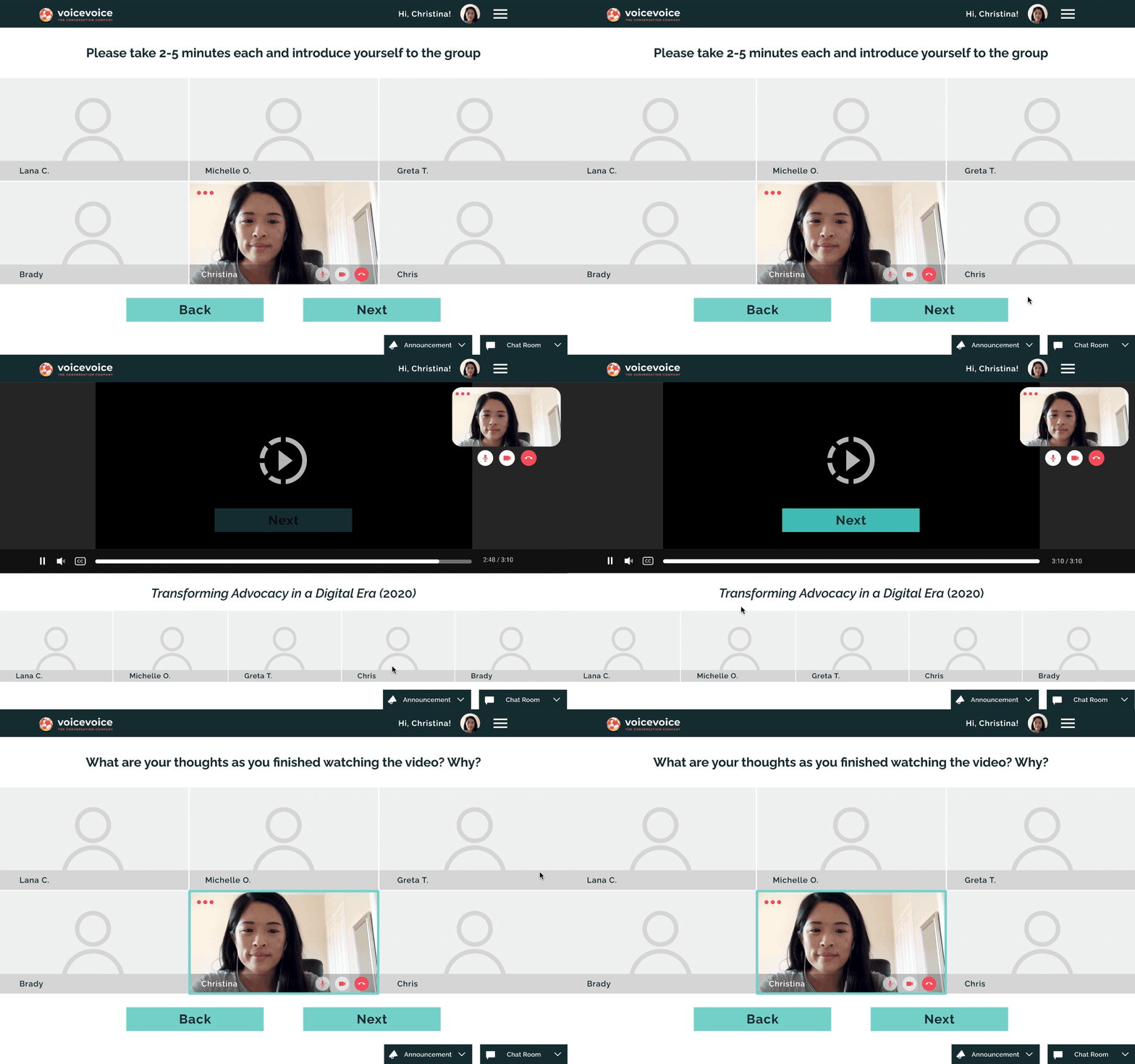
Reducing visual clutter to help attendees focus on group discussion
Keep user functions to bare essentials and reduce irrelevant information
Minimize user functions to only audio/video settings and discussion navigations
Redesigns show a 21% improvement in user task success rate
The main problem with our user testing was to find a way to measure success and how to show improvements in numeric metrics. We decided to first establish a guideline using User Task Success Rate in 0 - 100% scale, then replicate our usability task questionnaires to reflect stakeholder criteria of a successful redesign.
Standardized rubric helped us grade video recordings with a numeric value
Establishing a controlled numeric value helped us evaluate past conversation recordings objectively and set design direction for future iterations. We assessed the recordings on audio & video settings, group navigation preparedness, and host-less awareness.
The previous platform scored an average of 62% in User Task Success Rate
Analyzed conversation recordings to identify problems and transform them into opportunities
The goal for our redesigned platform is to see a 15% overall increase
Usability Test Questions
What was your expectation prior to joining the conversation? Can you briefly walk me through your thought process?
You’re looking to switch from your current laptop FaceTime HD Camera to test out a new Logitech HD Streaming webcam, where would you expect to find it?
Your discussion group has exhausted the current question prompt and you’re ready to move on, how would you proceed?
Redesign exceeded expectation and showed a significant 21% increase
Conducted five moderated usability tests with new users, using predetermined tasks
Redesigned wireframes scored 83%
Exceeded our original 15% increase goal
Reflection and Takeaways
Explore in-depth results with A/B Testing
While I’m proud of the 21% user success rate increase when comparing the current video platform to my redesigns, I’m curious to find out if one task was more significant than the other. If I was given more time on this project, I’d propose A/B testing to stakeholders for more precise results.
Communication amongst design partners
This internship pushed me to get out of my comfort zone and take the lead on several occasions because we did not work directly with a PM. On top of coordinating deadlines and presenter notes, I challenged myself to take the driver’s seat by giving more constructive feedbacks to teammates; as well as speaking up during stakeholder meetings.
Mobile design expansion
We focused on Voicevoice’s desktop platform for this project, with more design critiques and user testing, I’m interested in taking one step further and explore design solutions with a mobile platform.


